
Usability Testing on YSL Website
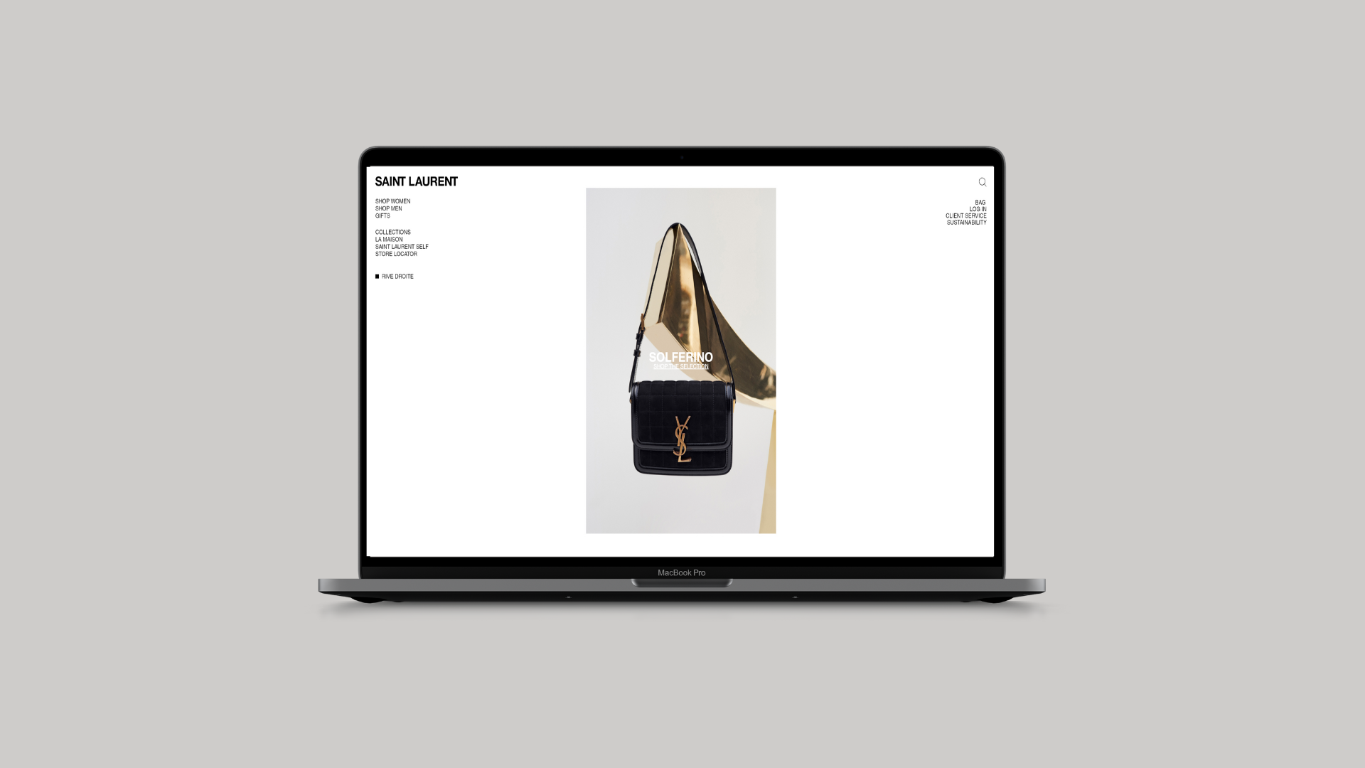
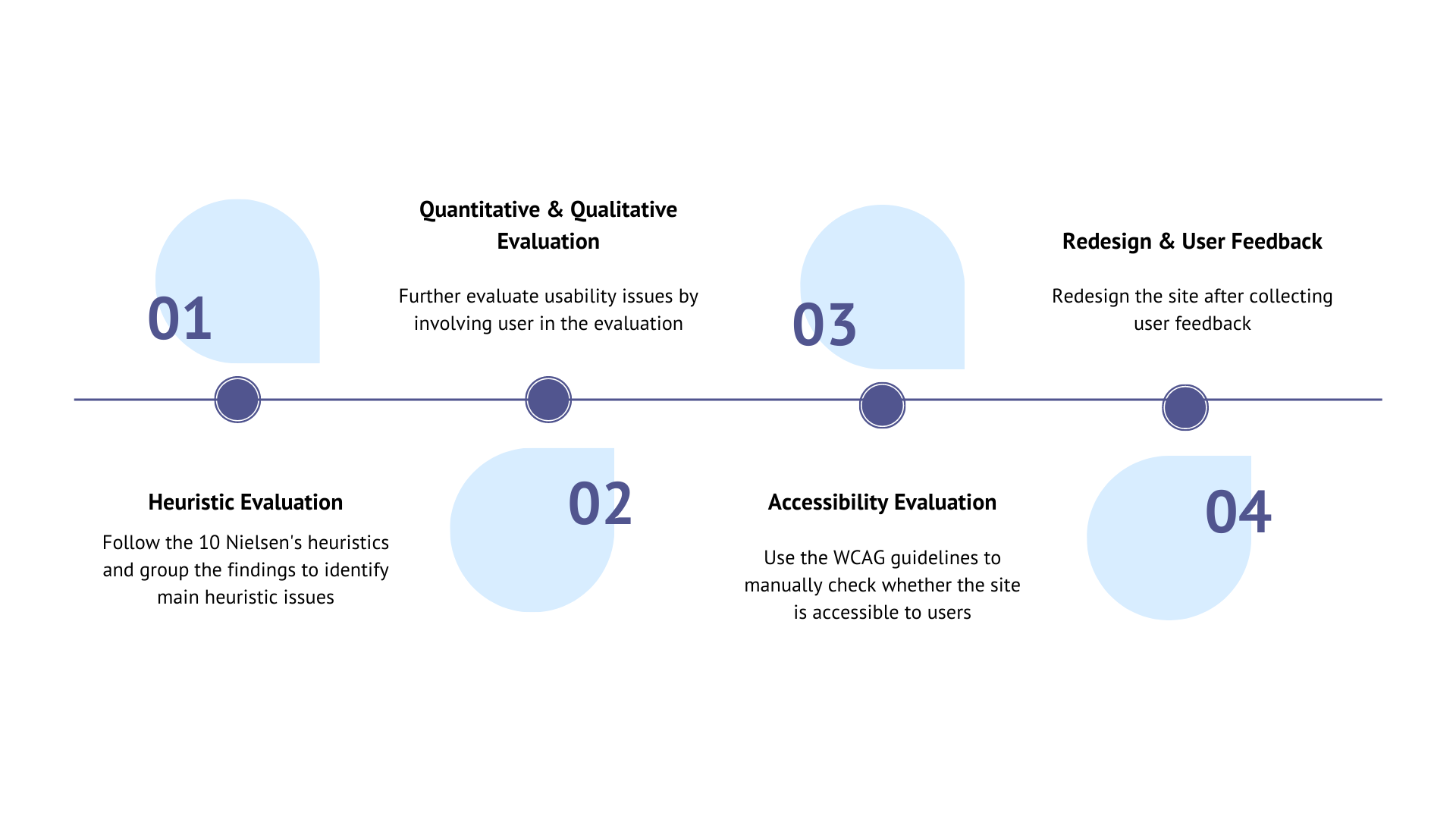
Redesign the YSL website by identify the main usability issues on the site, heuristic, quantitative, qualitative and accessibility evaluation has been conducted as part of the usability evaluation.
Project Deliverables
Personas
User flows
Heuristics evaluation
Quantitative analysis
Qualitative analysis
Accessibility analysis
User testing
Duration : 6 weeks
Tools : Figma
Role
UX Researcher
Promt
Improve the online e-commerce shopping experience for users by identifying and prioritizing main usability issues in the YSL website and redesign.
Design Process
Get familiar with the world of e-commerce
Secondary Research
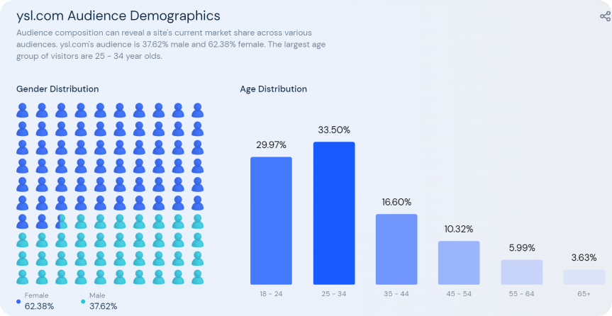
Based on the audience demographics collected from SimilarWeb, I identified the main user group of the YSL site are young female aged between 25 -34.
With this information, I make the group as the target user group and came up with respective personas.
Persona
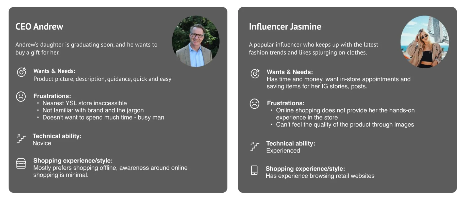
Eventually I developed two personas in the aim to cover more usability issues on the site. The two personas will have a separate user flow which would cover user’s most frequent tasks on e-commerce site.
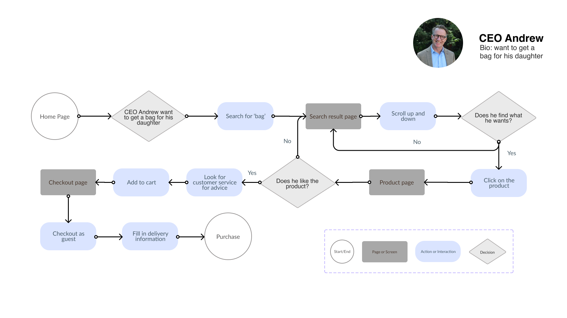
User Flow
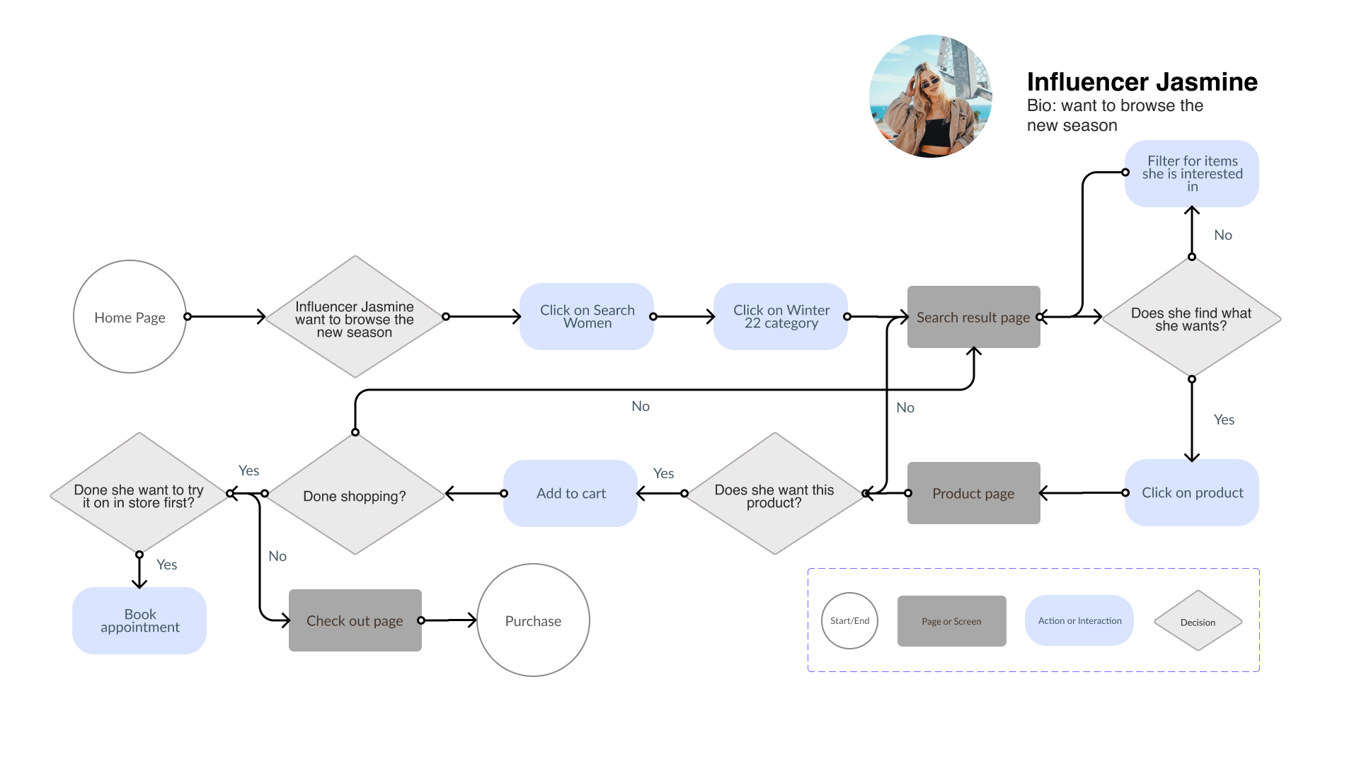
Heuristic evaluation is being conducted by following the two user flow illustrated above. The user flow aim to cover frequent tasks carried out by users (product description, delivery etc) to identify main usability issues that are most likely going to be encountered by users.
Evaluation without users
Heuristics Evaluation
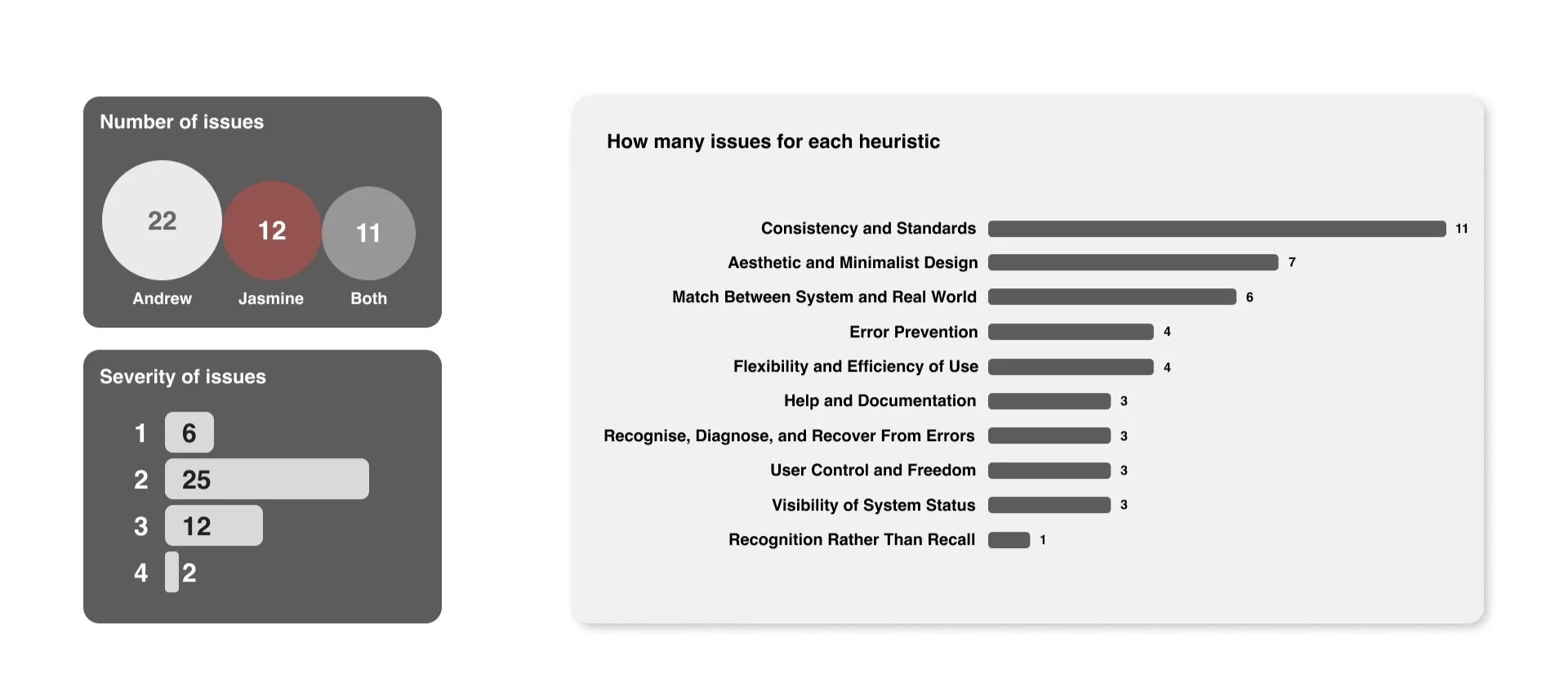
I used Nielsen’s 10 Usability Heuristics to guide the heuristic evaluation. This help me to get an overview of the usability issues on the site quickly and help narrow down key areas that need to be focus on. Here are the key findings and results.
Example:
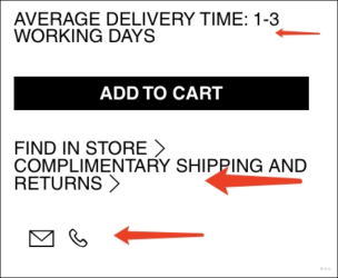
Without padding between these different elements, the otherwise minimal design becomes crowded and harder to click.
Evaluation with users
Quantitative Evaluation
Task & Goal: Purchase a black coat from the YSL website, in the process use the functions listed below.
Task Details

Methodology
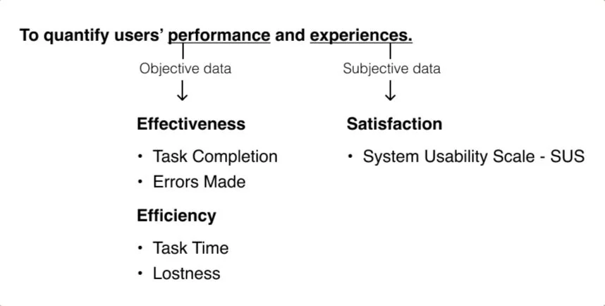
Findings in Quantitative Evaluation
-
All the participants made at least 1 error. Clicking the wrong button was the most common error made by participants (occurred 5 times in total), which followed by clicking the wrong page.
All participant took longer than the optimum/expected task time to complete each task, especially with the one involving the search function in which the task completion time doubles the expected task time.
The highest lostness score recorded is 0.5. ( 0=no lostness)
-
3 out of 5 participants had SUS scores below 50, 2 of them had SUS score between 50 - 70 and no one’s score over 70 which reflects a general low satisfaction with the YSL website.
Qualitative Evaluation
After looking at the quantitative data, I set out the user mission aiming to cover tasks that users made the most issues with. 4 participants has been recruited, the participants were asked to “think aloud” while going through the series of tasks.
User Mission : Find the cheapest black coat and, check sizing, check material, add to cart and check delivery information. Book appointment at a store in London.
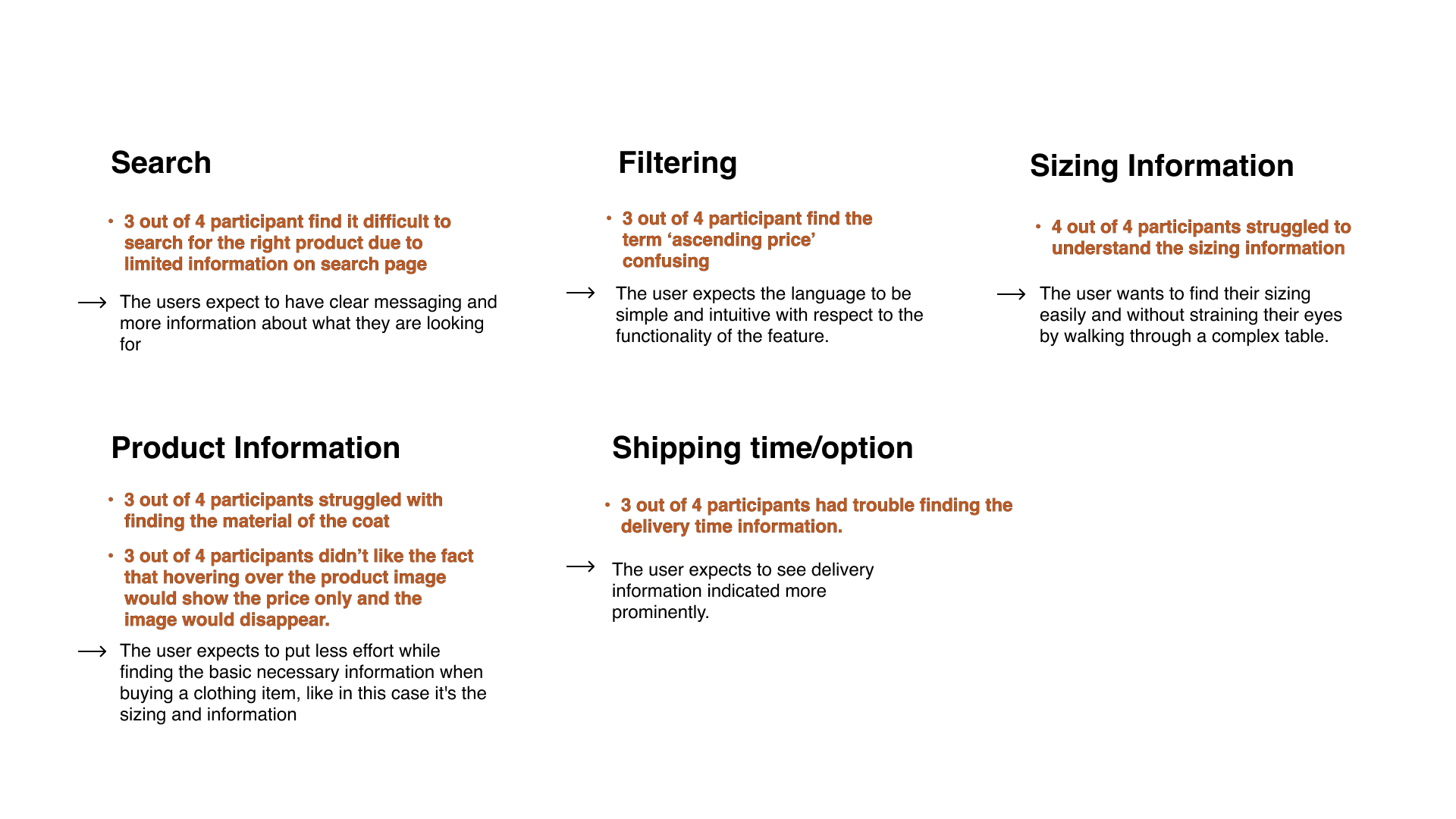
Thematic Analysis & Insights
I decided to group the observations under each task/functionality of the site. This gives a clear visual understanding of the area that require attention from a usability standpoint
Accessibility
Accessibility check is being conducted manually following the WCAG guideline and perceivable, operable, understandable, robust framework. 4 pages in total will be covered based on commonly visited pages in the user flow, which includes the home page, product list page, product page and checkout.
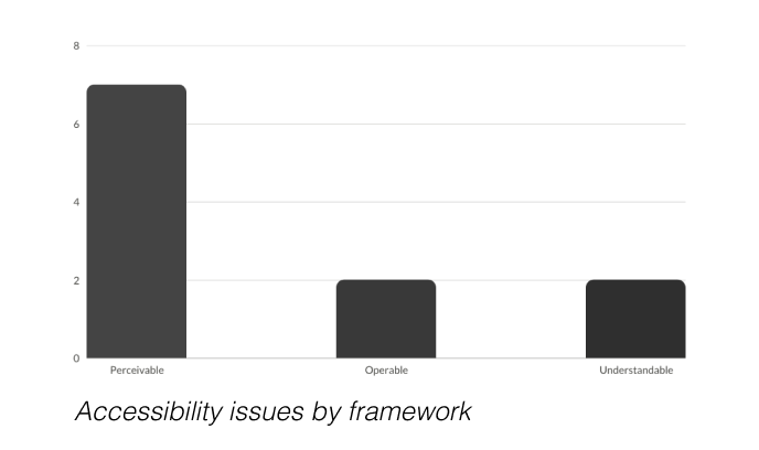
11 types of accessibility issues found across the website on the 4 key pages chosen, 7 issues types were in perceivable, making it the area with the most accessibility issues.
Example:
Perceivable: The high contrast of black text on white backgrounds is more difficult for users with dyslexia to read (W3.org, 2012) (Barstow, 2021).
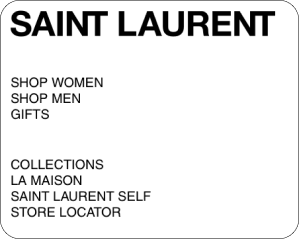
Understandable: Many link purposes and page titles are not easily understandable without additional context, for example what SAINT LAURENT SELF means, making the page difficult to understand for novice users (level A)
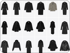
Perceivable: No text alternates for non-text content in the product list unless the user mouses of the images, meaning users with motor difficulties cannot easily see information (level A).
Priority Matrix
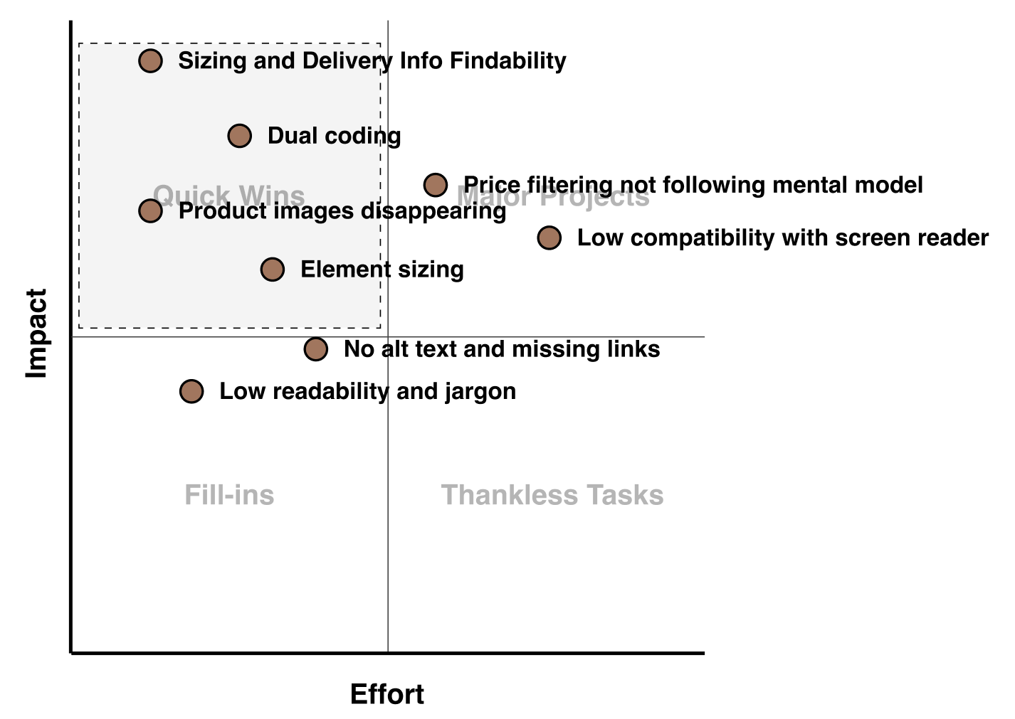
I then use the priority matrix to identify issues to should be addressed. first.
I selected most prominent issues from each evaluation and graded them 1-4 in impact, and 1-4 in effort. After plotted them on the graph, key issues from Quick Wins section will be the focus of the following redesign.
Key Issues and Implications

Dual coding with icons
Text complimented with icons can help users recognize functions easily and quickly, reduce time spent performing tasks hence help user to navigate the website
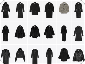
Product image missing
This can be annoying for the user to go back and forth with the mouse to see the pricing and product images, users a likely to miss a product they might be looking for.
Reflections
-
Cannot actually buy a product to experience the full flow and could not consider usability problem that are later perceived by users.
There are limitations to Nielsen's Heuristics compared to other models that can be used when compared to usability principles (Kritsch, 2022).
A key heuristic is aesthetic and minimalist design, however YSL’s design of took this to the extreme and affected usability, leading to a gap in the heuristic definition.
Proposed user flow might not reflect the actual flow that YSL target users go through
-
Usability tests would be quantified and measured using tools such as Maze to ensure accuracy or error rate, time stamps, etc.
More participants necessary to achieve stronger data correlations and transferability
Reference
Barstow, J.C. (2021). Adding A Dyslexia-Friendly Mode To A Website. [online] Smashing Magazine. Available at: https://www.smashingmagazine.com/2021/11/dyslexia-friendly-mode-website/ [Accessed 30 Oct. 2022].
Kritsch, M. (2022). Usability heuristic frameworks: which one is right for you? [online] Medium. Available at: https://uxdesign.cc/usability-heuristic-frameworks-which-one-is-right-for-you-1962387b7cc [Accessed 26 Oct. 2022].
W3.org. (2012). Optimal Colors to Improve Readability for People with Dyslexia - Text Customization for Readability Online Symposium. [online] Available at: https://www.w3.org/WAI/RD/2012/text-customization/r11.